COMPANY
Procore Technologies / procore.com / 2020
MY ROLE
Discovery research; Design UX from wires to final UI for web, Android, & iOS; Usability Testing; Create & document new design patterns
TEAMMATES
UX: Victor; UI: Michael Kubota [components], Taylor Klundt [diagram] / Product: Arsh Kaur / Eng: Rudy Newball [Android]. Scott Walstead [iOS], Justin Watts, Kat Rossi, Thomas O’Boyle
SUMMARY
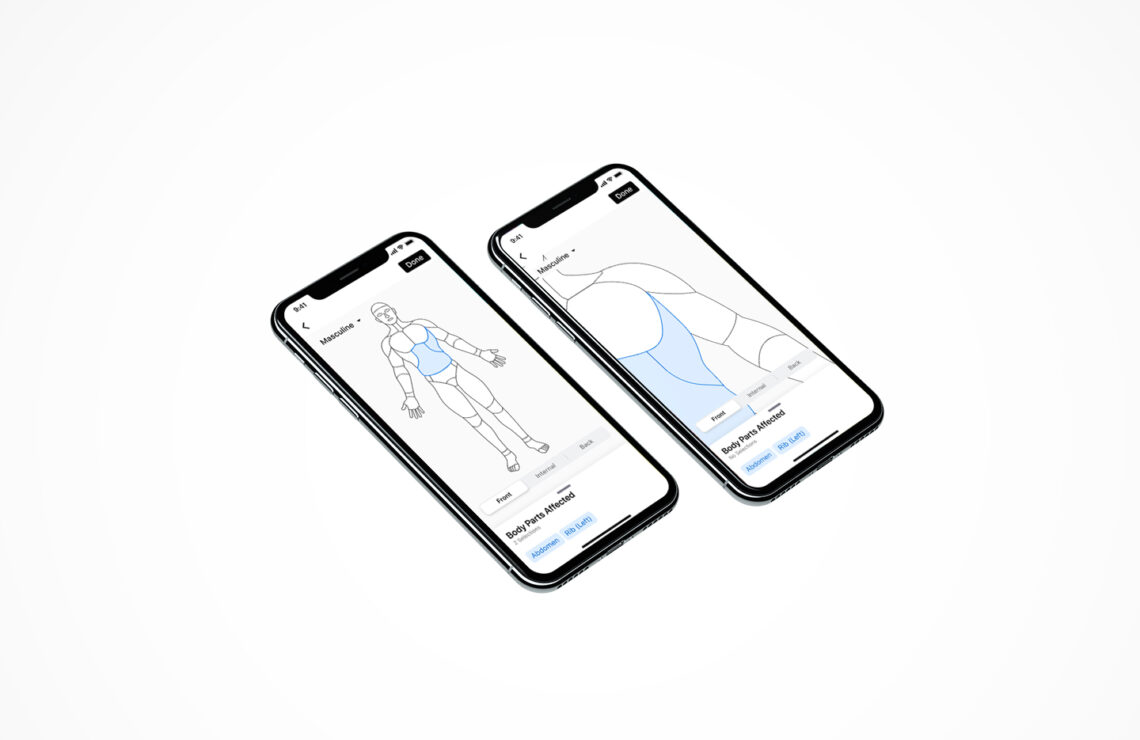
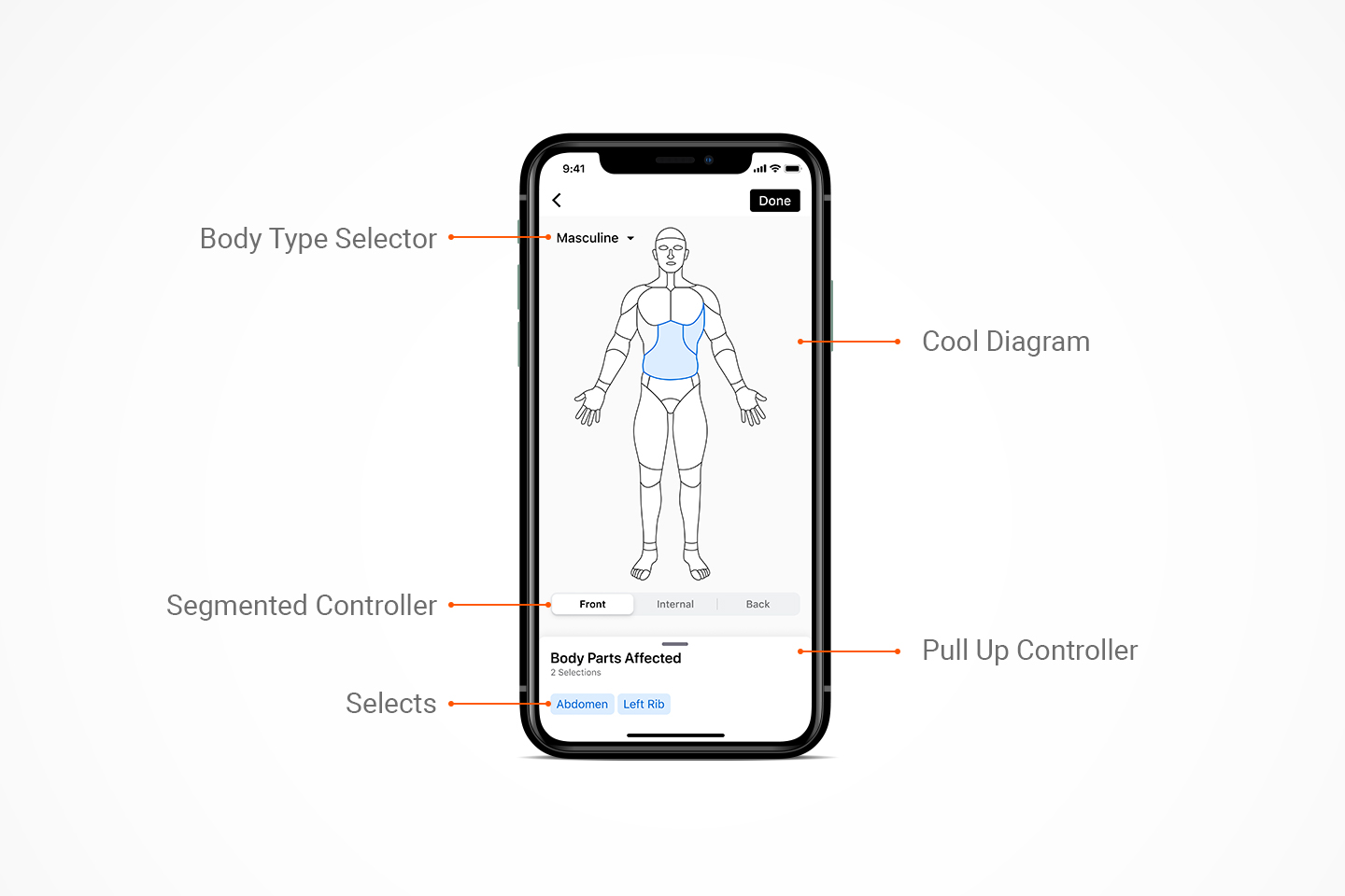
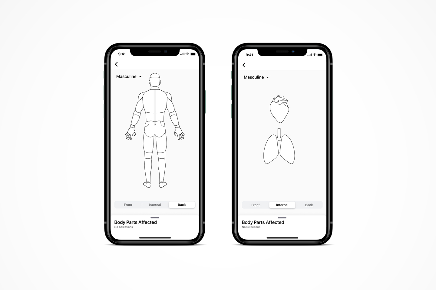
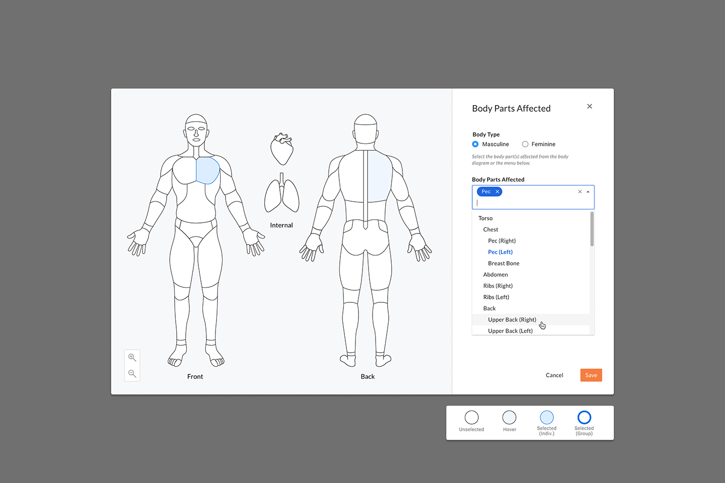
The Body Parts Affected feature is embedded in the Procore Quality and Safety Incidents tool, which captures and manages safety related issues and documents unfortunate accidents on construction job sites easily and accurately.
PROBLEM / CHALLENGE
- Existing experience allowed few body part selections & tried to capture too much in a drop down
- Reporting / Ability to Spot Trends was challenges with so few details being captured
- Existing experience limited the ability for users to stay compliant
HOW WE’D MEASURE SUCCESS
⏱️
Reduction of time on task
🎛️
More engagement
📋
Increase in initial field completion rate
OUTCOMES
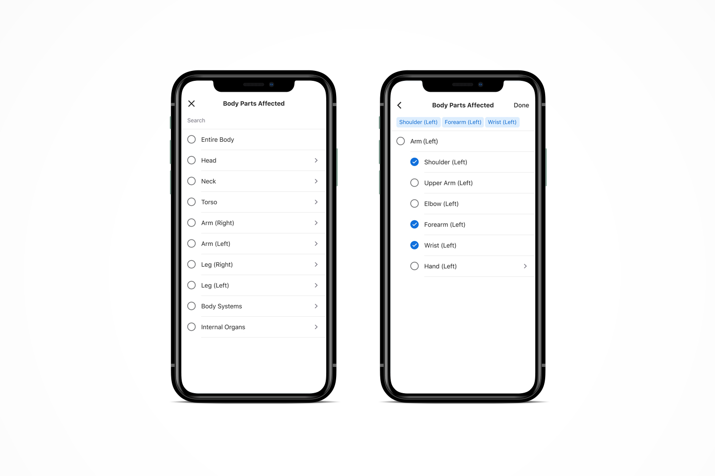
SETTLING ON THE BODY PARTS / GROUPS
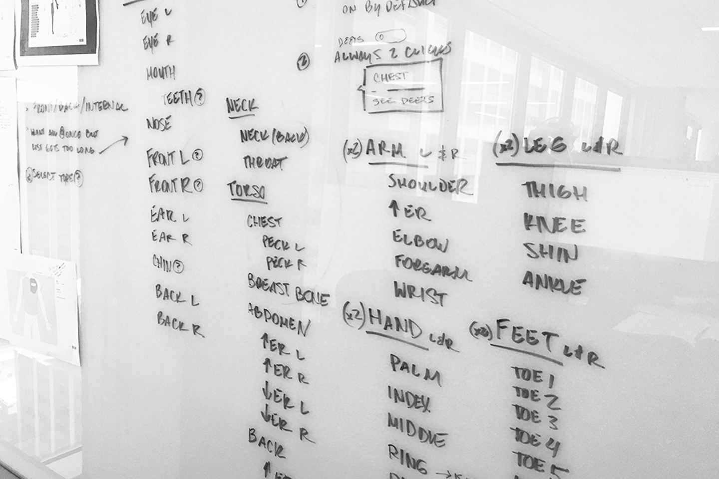
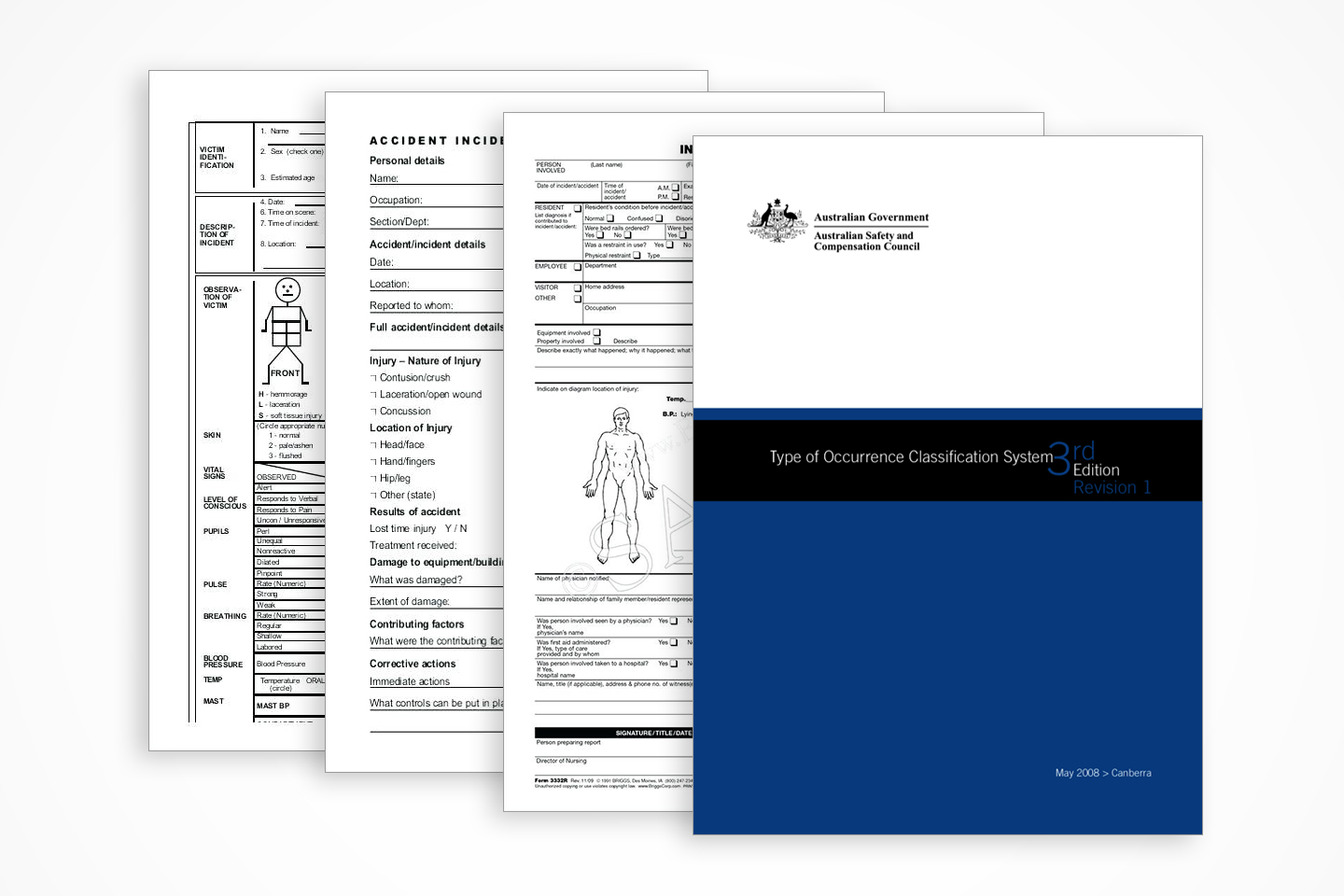
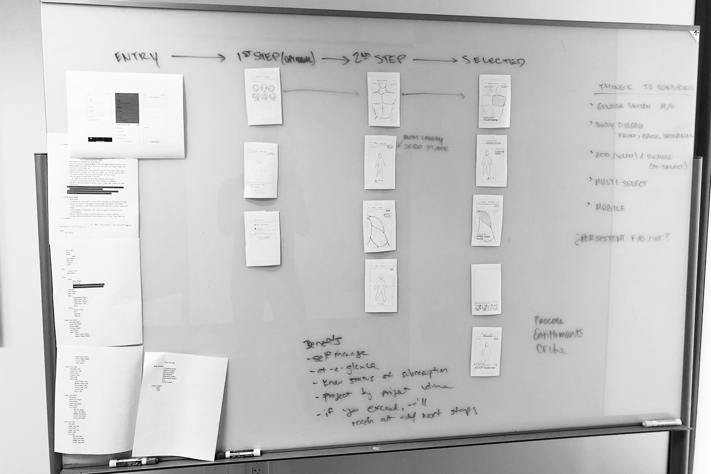
After finishing up discovery, I started by reviewing OSHA and Worksafe Australia compliance standards for incidents and related body parts affected classifications. It was critical that the selections could easily roll up to compliance forms domestically and internationally. After diving in to the compliance docs, I worked through the body parts list.
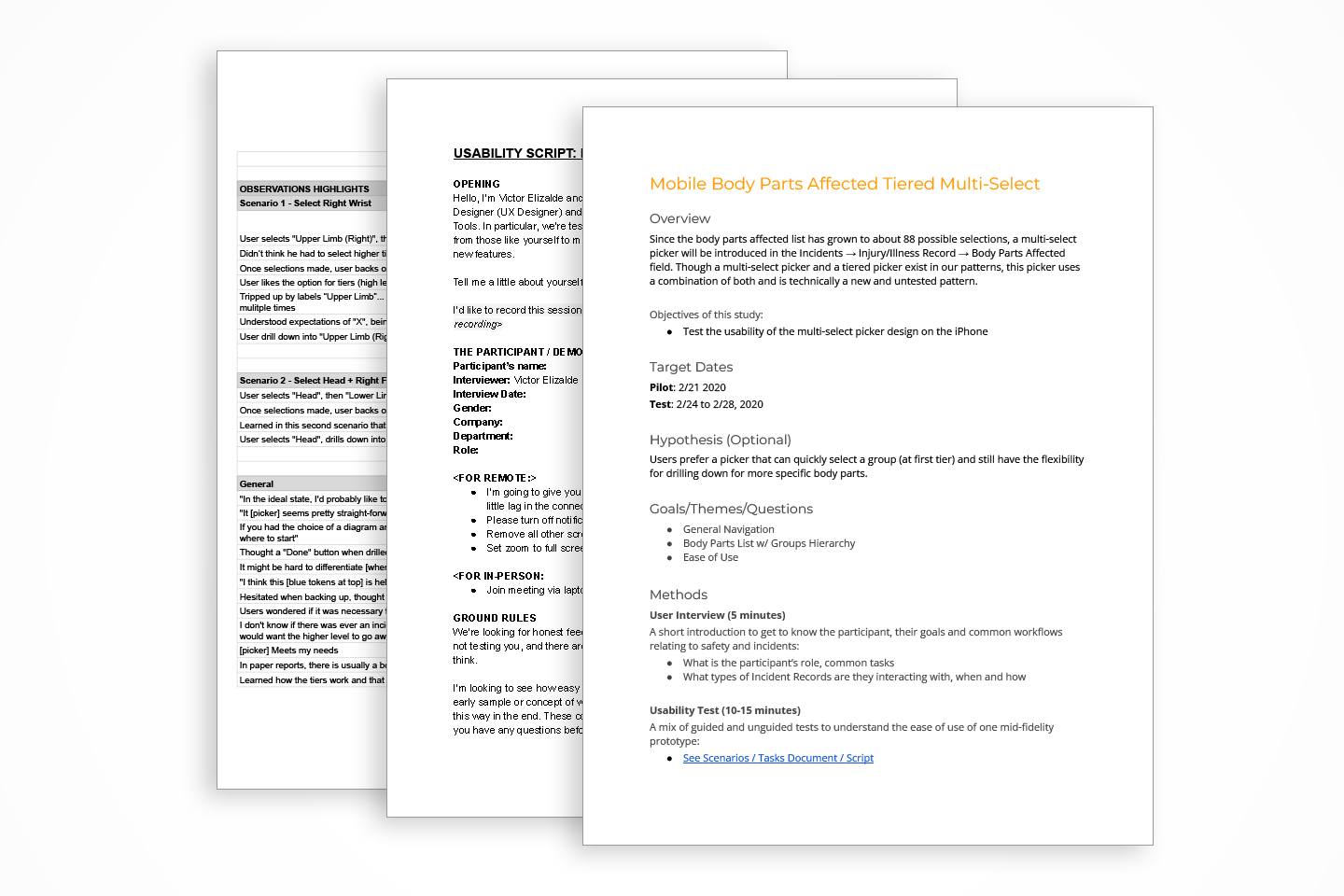
USABILITY TESTING & SUS TESTS
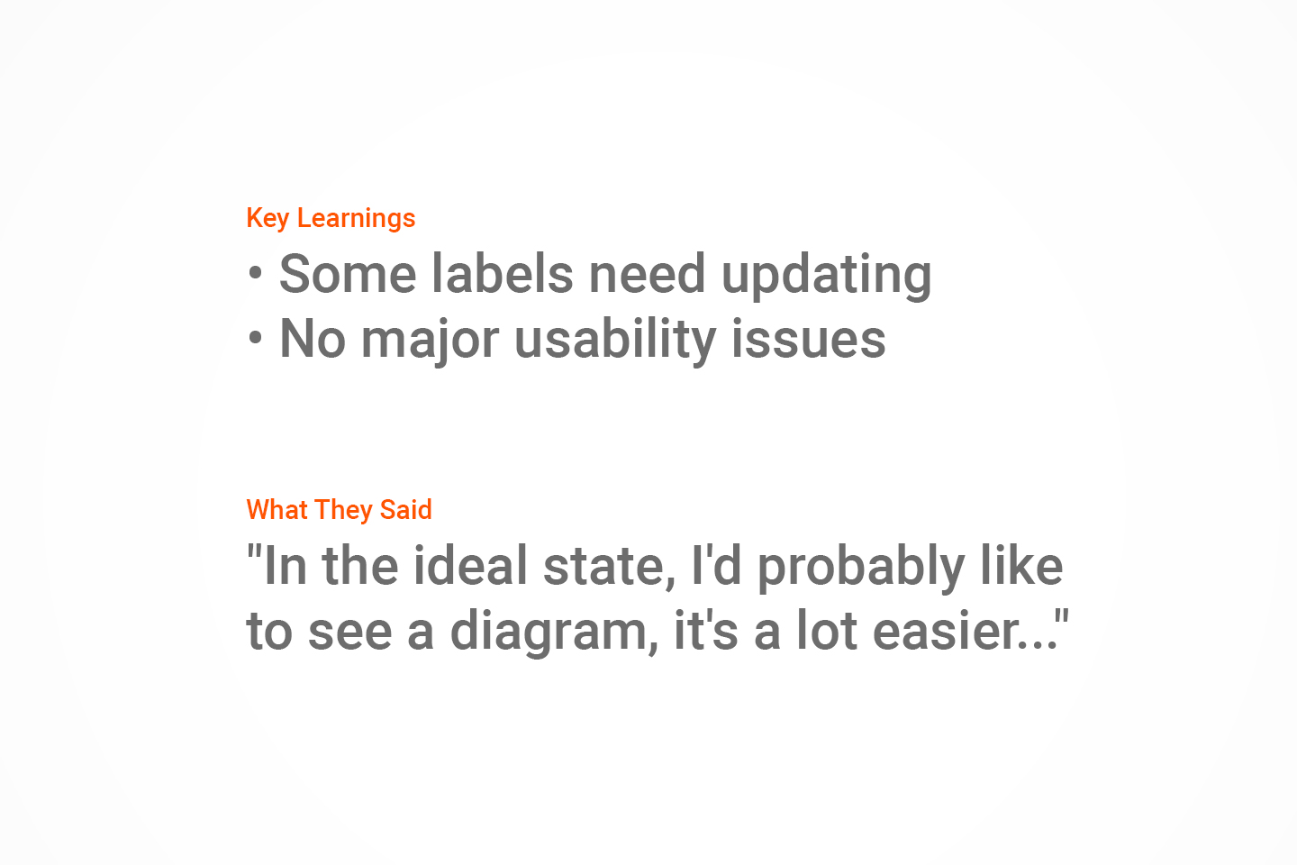
Once the list was compiled, I set up a clickable prototype for Usability Testing. I tacked on a System Usability Scale Test (SUS Test) to the research for quant data for Usability and Learnability. Then, I tweaked the list to tighten up the design.
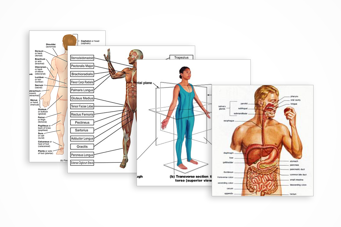
THE BODY DIAGRAM
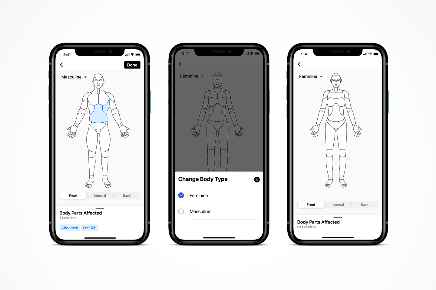
The picker was solid, the list was solid, but what about the diagram itself? I was challenged balancing the right level of fidelity to match the list. Also, what style should the digram be? Photo realistic? Illustrated? 3d?
FINAL DESIGNS
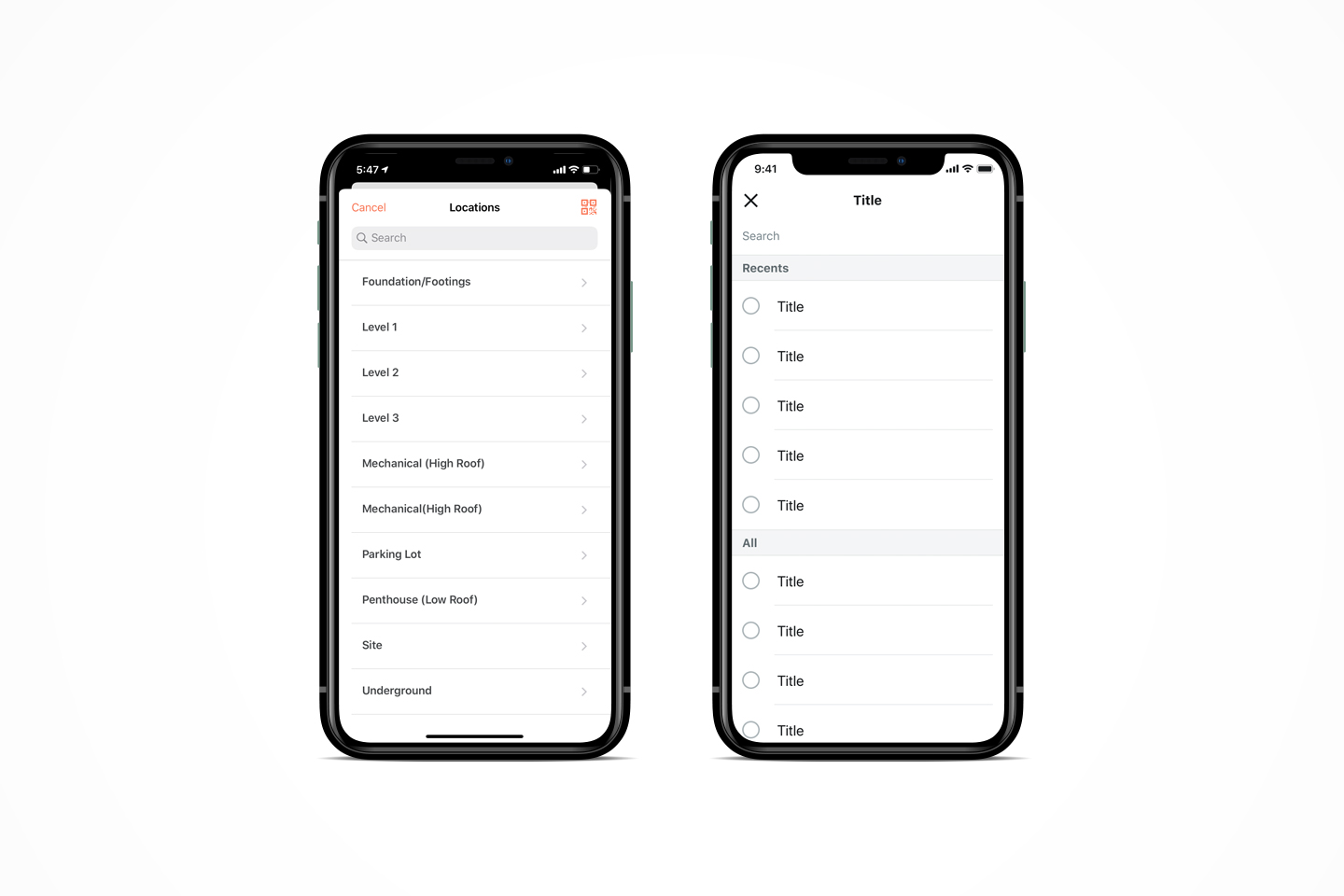
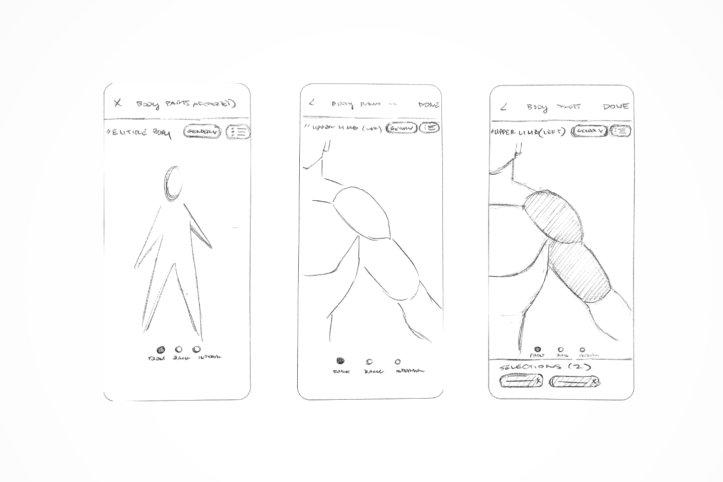
Once the diagram was set, I sketched out some interactions and got some feedback on workflows for web and mobile. Then I partnered up with the UI team to polish up the final designs. Lastly, I documented key workflows to review with the dev team.
50%
Reduction of time on task
16%
More engagement
80%
Increase in initial field completion rate
OTHER OUTCOMES
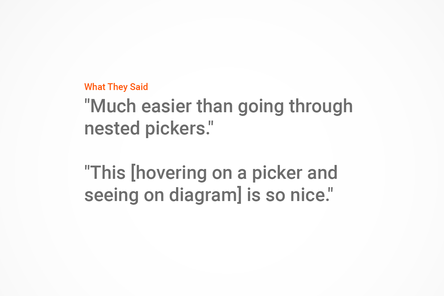
- Users said it was “easy and fun” to use
- Was part of larger effort to gain international adoption & usage
- Improved Product-Market Fit
- Improved Reputation of a Comprehensive Solution and Market Leader
REFLECTIONS
This was a challenging and fun project, as the construction industry was a new space for me at the time. I enjoyed pushing the bounds of the existing component mobile and web libraries and overcoming the challenges of compliance complexity. 5 stars, would recommend!
