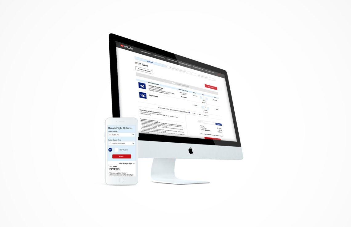
COMPANY
iFLY / Cart Optimization / 2016
MY ROLE
Research, Design UX process for booking, buying & scheduling iFLY flights, usability testing
TEAMMATES
UX/UI: Victor / Key Stakeholder: CMO / Product / Eng: iFLY engineering team
SUMMARY
The iFLY Indoor Skydiving brand wanted to implement a book, buy and checkout process on their website to make it a true e-commerce site and increase conversion. Their existing site took users to a 3rd party to book securely and conversion was low. However, with UX changes, we saw a 20% increase in conversion (bookings), 40% decrease in CS phone calls, and unlocked cross sell opportunities.
PROBLEM / CHALLENGE
- Conversion was poor, with large drop off sending users to a 3rd party
- No in-house Designers to guide UX standards
- No re-marketing, up-sell, or cross-sell opportunities
- Pricing changed by iFLY Location and time of day
HOW WE’D MEASURE SUCCESS
🎟️
Improve conversion (bookings)
💸
Increase average cart value
📞
Decrease Customer Service calls
OUTCOMES
RESEARCH & RECOMMENDATIONS
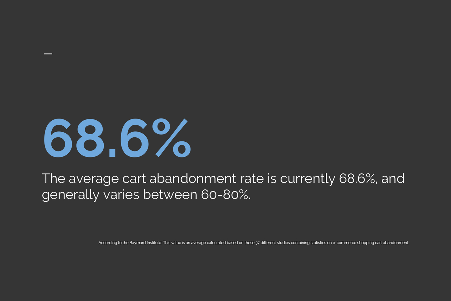
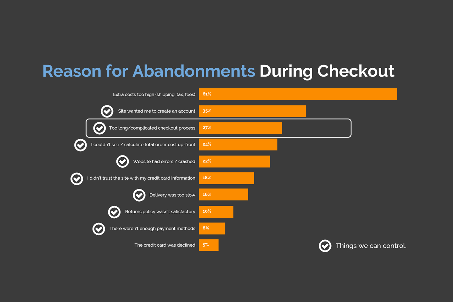
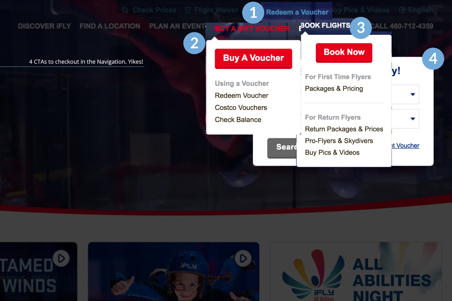
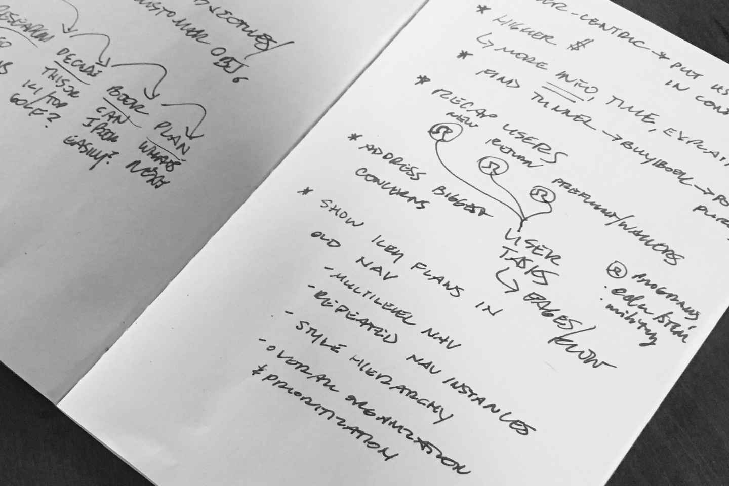
I did a lot of research on good UX practices for checkout as well as looked at common reasons for cart abandonment. Here were a few findings as well as initial site issues.
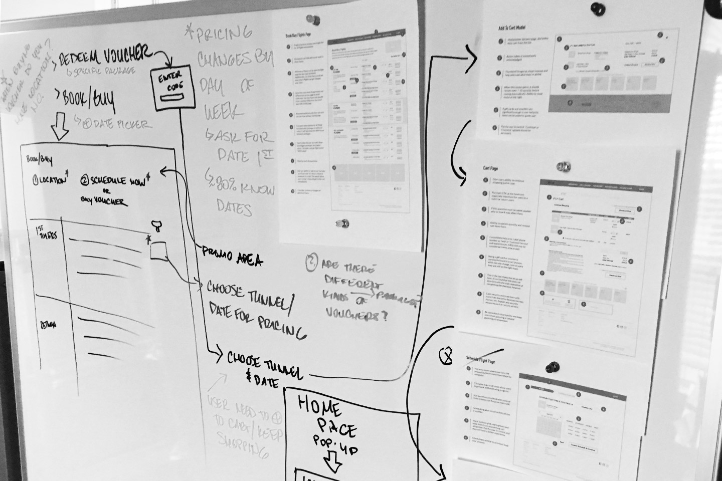
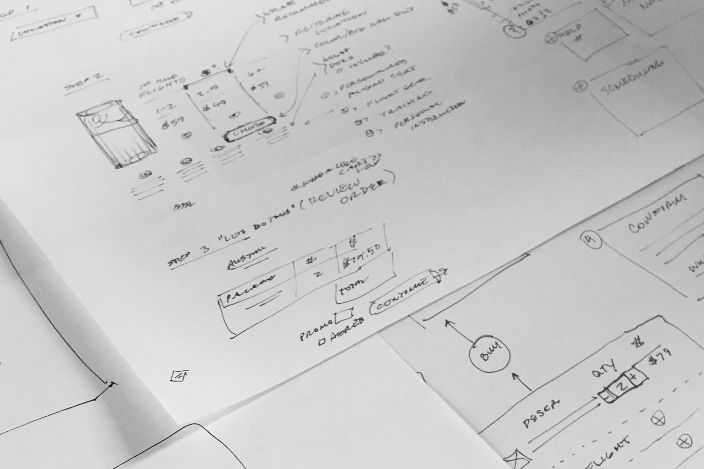
SKETCHES & WHITEBOARDING
Once the research was complete, I sketched out a process for the surprisingly complex cart experience. I went through many iterations and evaluated the best option for meeting the business and user goals.
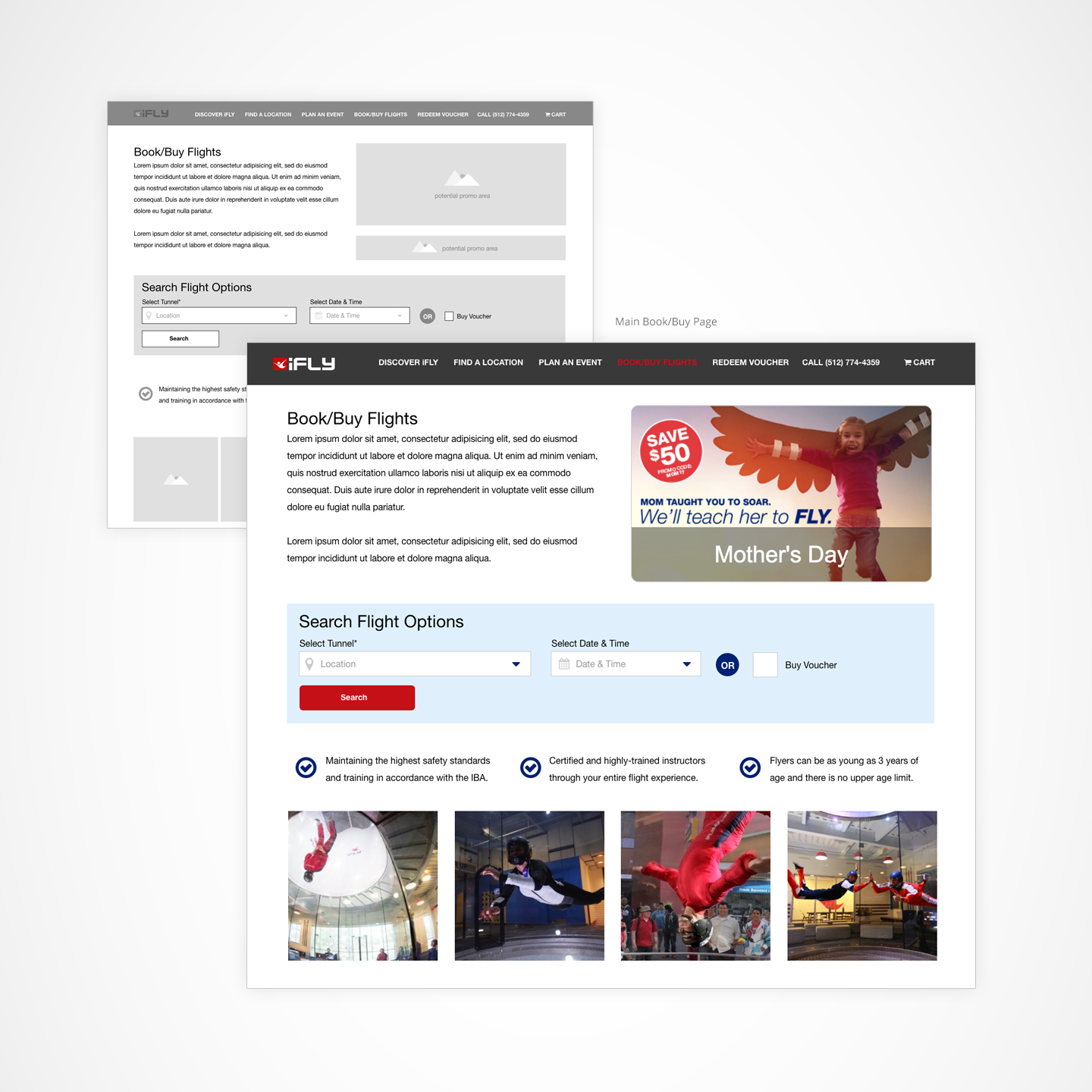
WIRES & FINAL UI (DESKTOP)
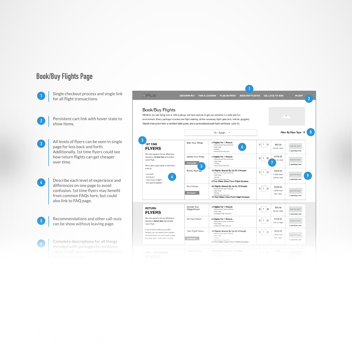
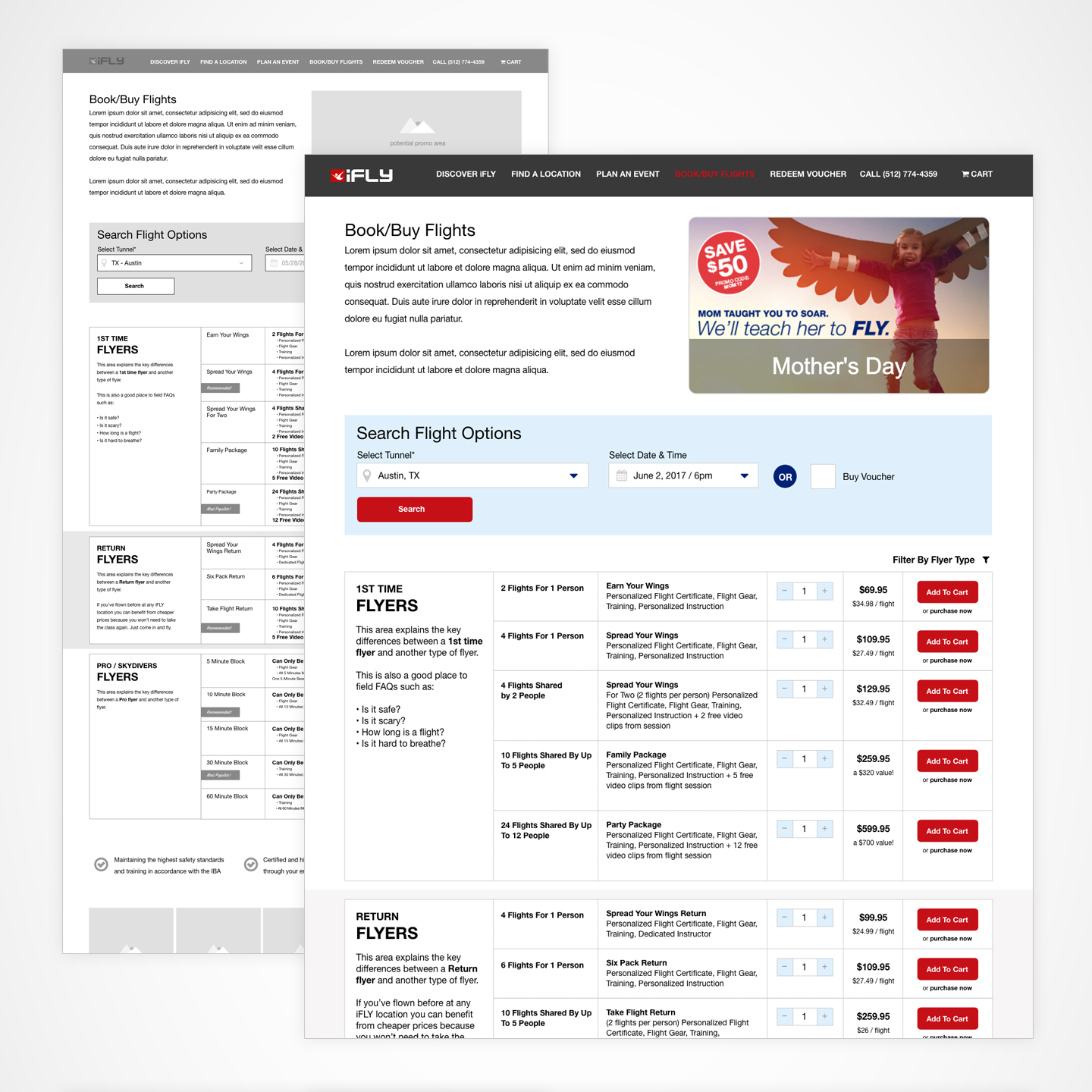
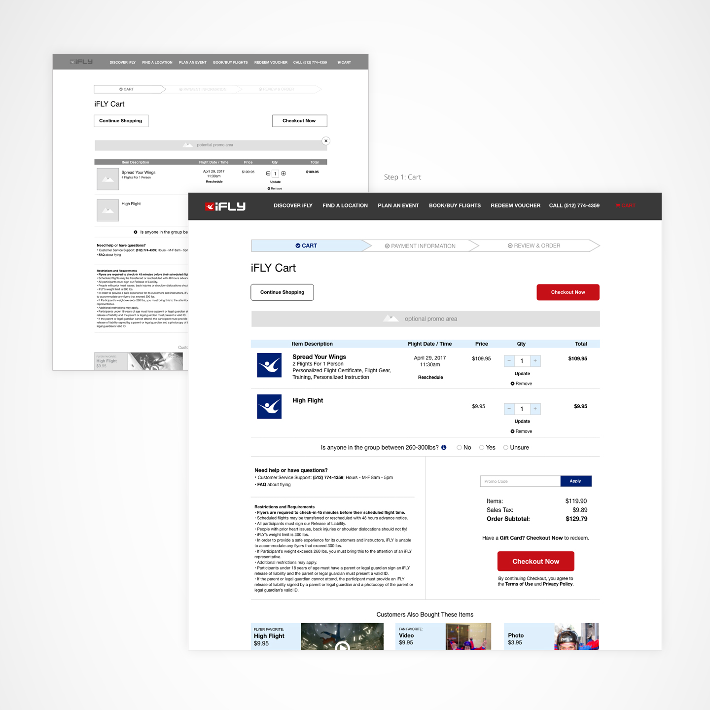
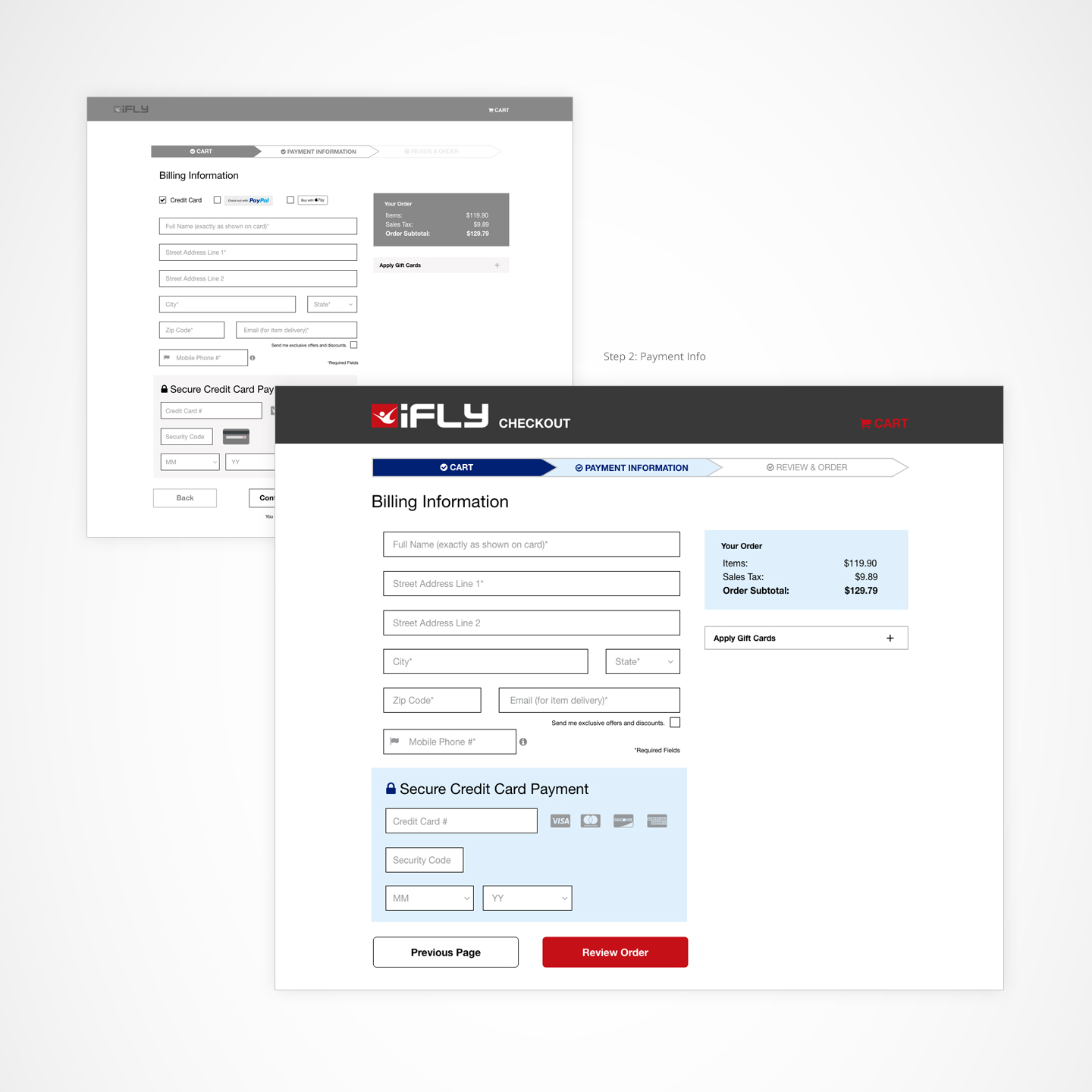
I built wires and a clickable prototype using Adobe XD, and annotated the UX changes to communicate clearly to the Product and Marketing team.
FINAL UI (MOBILE)
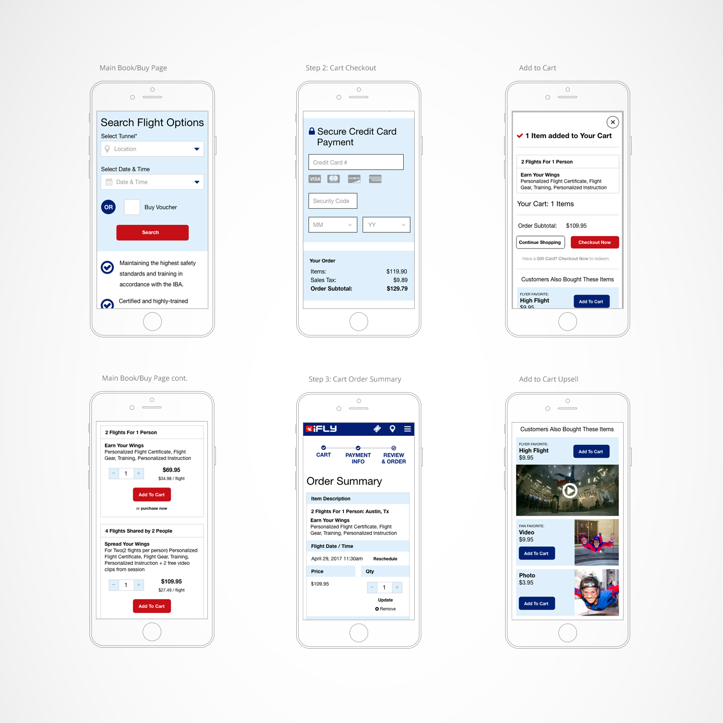
Here are some of the mobile screens for the cart process including opportunities for cross-sell, up-sell in the cart experience. We also allowed a user’s cart content to be preserved for 14 days, giving marketing the opportunity to re-market users and encourage them to complete their transaction.
HOW WE DID
20%
Improvement in conversion rate (bookings)
11%
Increased average cart value
40%
Reduction in Customer Service calls
OTHER OUTCOMES
The iFLY CMO was pleased enough with my consulting and UX work that they asked me to redesign their whole corporate site.
REFLECTIONS
Work with what you got. When a client doesn’t have the information or resources for full User or Usability Testing, leveraging best UX practices backed by UX research (in this case Nielson/Norman Group studies) is the next best thing.
